
User Interface
User Interface Elements
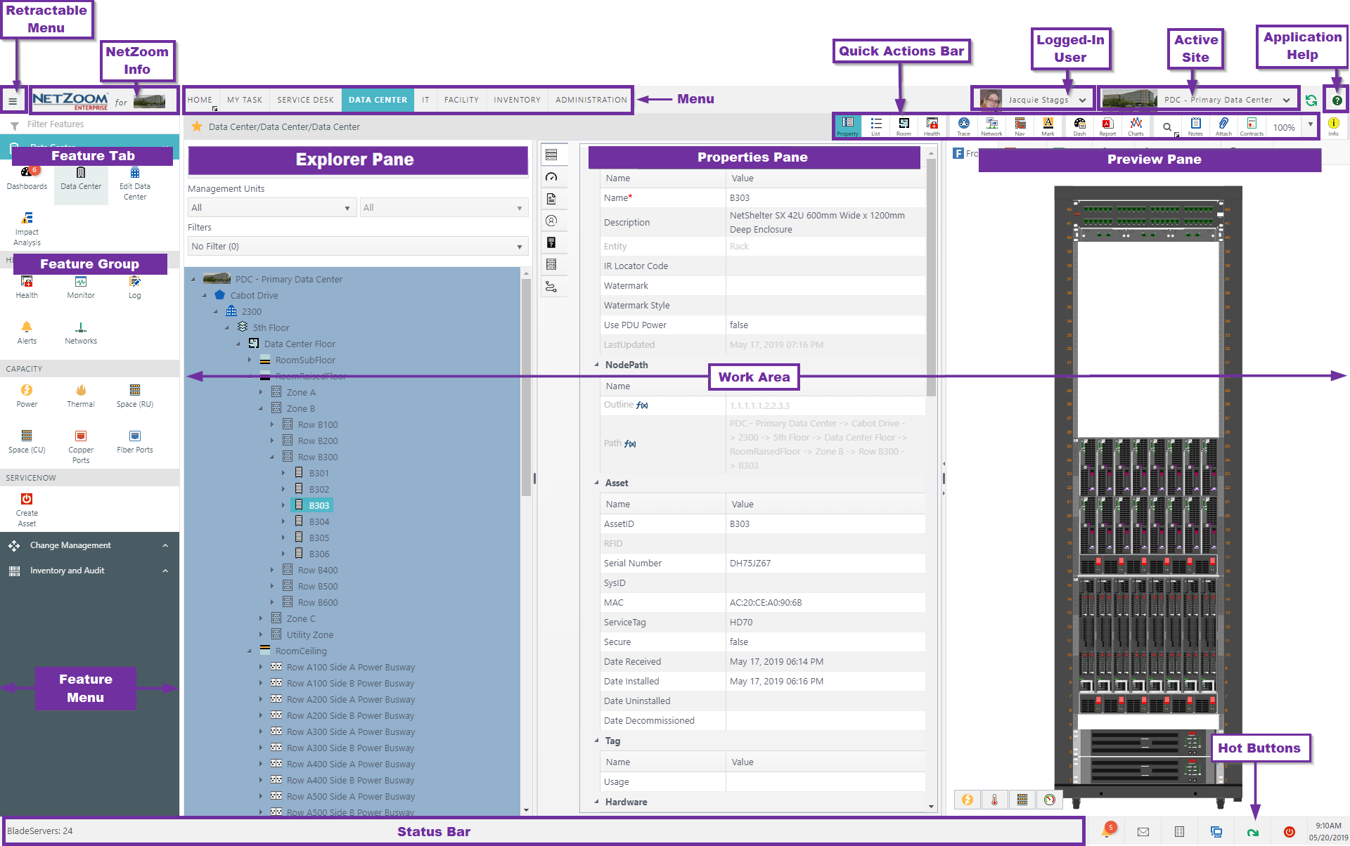
Retractable Menu
Clicking the Retractable Menu icon hides or displays the feature menu.
NetZoom Information
NetZoom Information is the pop-up that appears when clicking the NetZoom logo in the upper left corner. It presents information about the license, NetZoom Inc. contact details, End User License Agreement (EULA) and data center rack count in real time.
Menu
Menus are fundamental feature modules responsible for a specific set of functions. Clicking on a menu will present its features in the feature menu/pane.
Logged-in User
Logged-in User displays the profile of the logged in user including its Name, Email, Profile Picture, Role and any other users who were delegated impersonation of this user account.
Active Site
Active Site displays all available sites to the logged-in user, as well as the site in which the user is logged-in. Each site profile includes its Name, Address, local Date and Time where the site is located.
Feature Tab
Feature Tab is a subset of menu and includes one or more Feature Groups.
Feature Group
Feature group is one or more related features.
Features
A feature offers a use case.
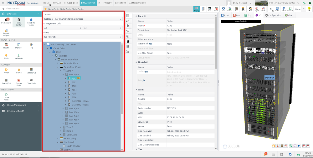
Explorer Pane
The Explorer Pane displays the data center, the devices, and/or main elements of the selected feature. The purpose of the Explorer Pane is to enable navigation within a location or a feature.
Properties Pane
The Properties Pane displays the attributes, properties or details of the selected element.
Preview Pane
The Preview Pane displays a graphical representation of the selected object or information about the selected object in whatever format is appropriate.
Panes Other
NetZoom displays information in dynamic panes which change according to the selected feature or object and feature. As a rule, the Panes follow the logic similar to most user interfaces: Object, Object Information or Details and Object Preview.
Quick Actions
The Quick Actions are contextual commands that change according to the selected feature.
Work Area
The Work Area is the dynamic part of the screen where the actual feature interface is displayed or implemented.
Status Bar
The Status Bar displays system messages, task status messages and page notifications.
Application Quick Actions (Hot Buttons)
Application actions such as alerts, background tasks and logout. By clicking on certain Application actions, a retractable pane will display additional information about the selected item. These are also known as “Hot Buttons.”
Panes
NetZoom implements a user interface screen that is divided into one or more panels, or Panes, displaying information.
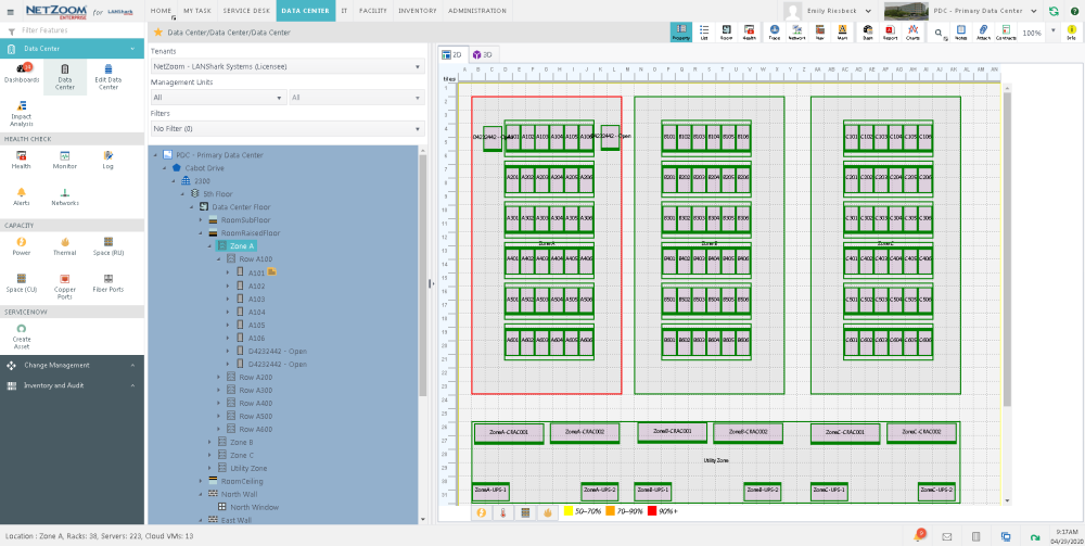
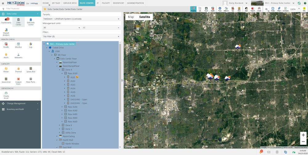
Infrastructure Explorer Pane
The Infrastructure Explorer presents a hierarchy of locations and devices in a filtered view. The infrastructure explorer includes fine levels of detail for both locations, including walls, windows and floors; and devices, including modules and ports.
The Infrastructure Explorer offers a multi-tiered filter, refining results by Tenants, Management Units, and criteria Filters. For more information on the Infrastructure Explorer, see the Infrastructure Explorer section below.
Details Pane
A selected item is identified by its properties which are displayed in the Details Pane. The properties vary based on the item selected and the feature in which it appears.
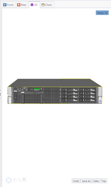
Device Preview Pane
The Device Preview Pane displays a visual representation of a device.
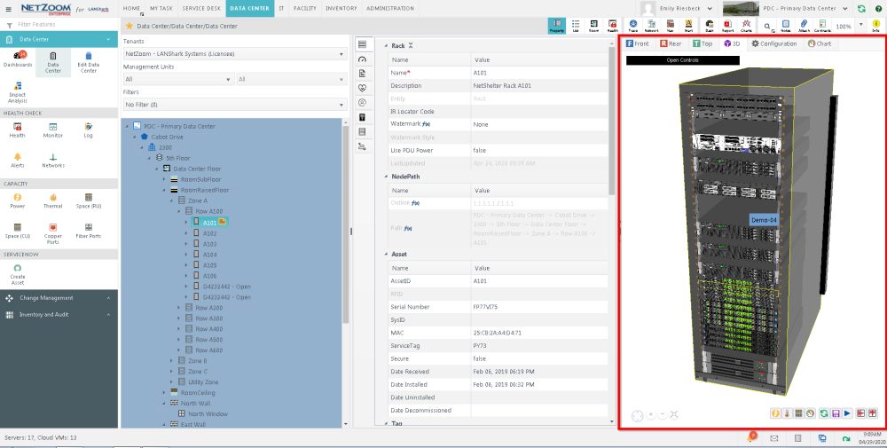
The following preview modes are available:
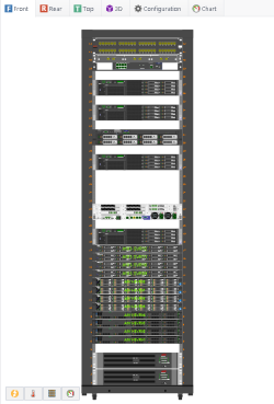
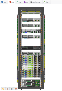
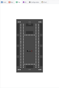
2D Device View
Front
This is the frontal view of a device.
Rear
This is the back view of a device.
Top
This is the view from above a device.
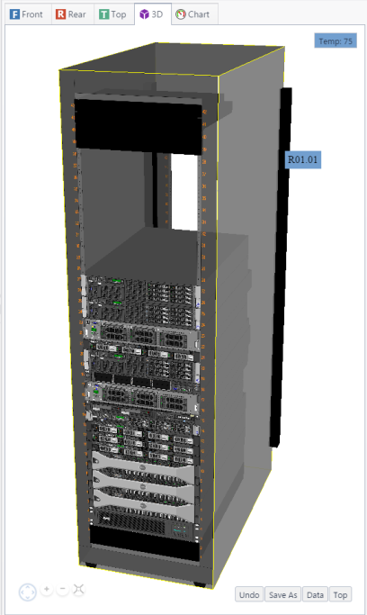
3D Device View
This is a tree-dimensional view of a device.
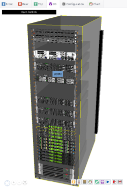
Commands
In the 3D Device View, the following commands are available:
- Rotate: Controls the angle of the object. Click “Up,” “Down,” “Left” or “Right” arrows to rotate.
- Zoom In/Zoom Out: Changes the zoom level of the object. The “plus” icon magnifies, and the “minus” minimizes.
- Reset View: resets the object view to the default position.
- Show Power: Displays the power being used be each device directly above it.
- Show Temperature: Displays the temperature of each device directly above it.
- Show Space: Shows the amount of space available (where applicable).
- Select Data Fields: offers to preview data for other fields.
- Undo: Reverts the 3D view to default.
- Save Image: Saves an image file of the selected node to your default download folder.
- Auto Rotate: Causes the 3D preview image to slowly rotate.
- Top View Rotated: Toggles the 2D top view rotated 90 degrees.
- Top View: Toggles the 2D top view.
Configuration
This displays the configuration of the selected device (when applicable). For example, selecting a rack will highlight all devices installed in the rack and the RU they are installed in.
Chart
This will display capacity charts for the selected device. For more information on capacity charts, see [capacity documentation].
Device Properties Pane
All devices are defined by their properties which are displayed under tabs in the Device Properties Pane. The properties vary based on the type of the device they represent.
Example Properties of Rack Device
| Tab | Property | Description |
| Property | Device | Basic details about the device such as name, description, type and watermarks, if any. |
| Node Path | The location path of the device. | |
| Asset | Physical and network asset identifiers such as Asset ID, Serial Number, Sys ID, MAC, RFID Tag, Service Tag. | |
| Tag | The asset's Tag. | |
| Hardware | EQID, Manufacturer, Equipment Type, Manufacturer Equipment Type, Product Line, Product Number, Product Description, Website URL, End of Life. | |
| Dimension | Height, Width, Depth, Weight | |
| Tile Position | X, Y, Tile Position, Orientation (Angle), Offset. | |
| Capacity Summary | Cooling, Heat, Power, RU, Temperature, Ports, Weight. | |
| Capacity | RU Capacity | RU (Provision, De-rated, Threshold, Real Time, Blocked, Free, Maximum Load). |
| Power Capacity | Power (Provision, De-rated, Threshold, User Defined, Real Time, Free). | |
| Heat Capacity | Heat (Provision, De-rated, Threshold, User Defined, Real Time, Free). | |
| Temperature Capacity | Temperature (Provision, De-rated, Threshold, User Defined, Real Time, Free). | |
| Cooling Capacity | Cooling (Provision, De-rated, Threshold, User Defined, Real Time, Free). | |
| Temperature Capacity | Temperature (Provision, De-rated, Threshold, User Defined, Real Time, Free). | |
| Total Power Ports | Power Ports (Provision, De-rated, Threshold, User Defined, Real Time, Free). | |
| Total Fiber Ports | Fiber Ports (Provision, De-rated, Threshold, User Defined, Real Time, Free, Blocked Port). | |
| Total Copper Ports | Copper Ports (Provision, De-rated, Threshold, User Defined, Real Time, Free, Blocked Port). | |
| Weight Capacity | Weight (Provision, De-rated, Threshold, User Defined, Real Time, Free). | |
| Warranty | Warranty | Vendor, Price, Start Date Of Warranty, End Date Of Warranty, Life Span, Value After Life Span, Residual Value. |
| Purchase | Vendor, Price, Start Date Of Warranty, End Date Of Warranty, Life Span, Value After Life Span, Residual Value. | |
| Owner | Tenants, management units and sub-units that own the device. | |
| Cables | Cables connected to this device by Name, Type, Description. |
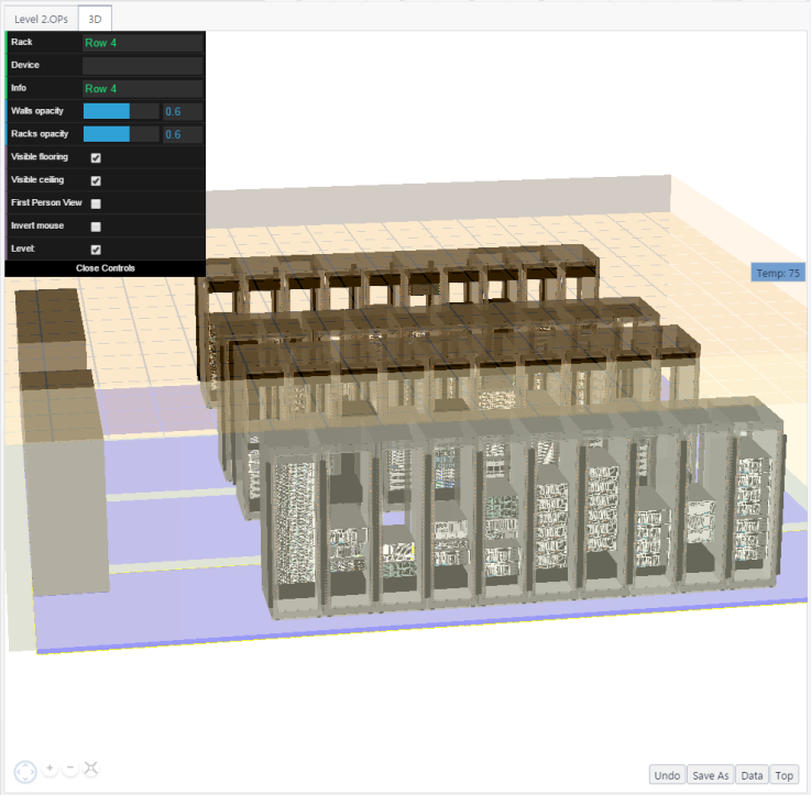
Location Preview Pane
In NetZoom, locations can be previewed in 2D and 3D views.
2D Location View
Displays an actionable floor layout on a 2D canvas. Double-clicking on a rack will select that rack in the infrastructure explorer.
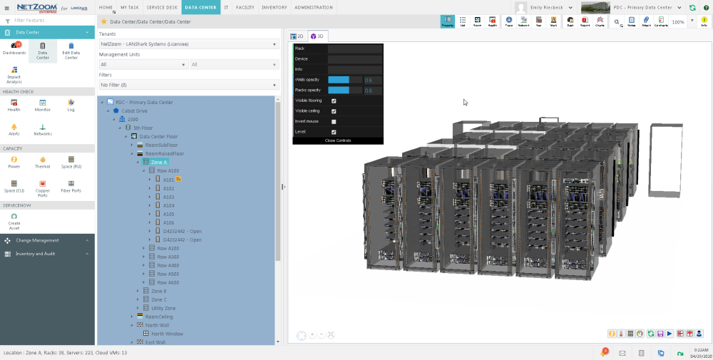
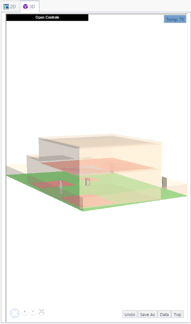
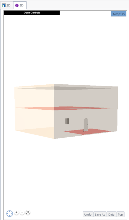
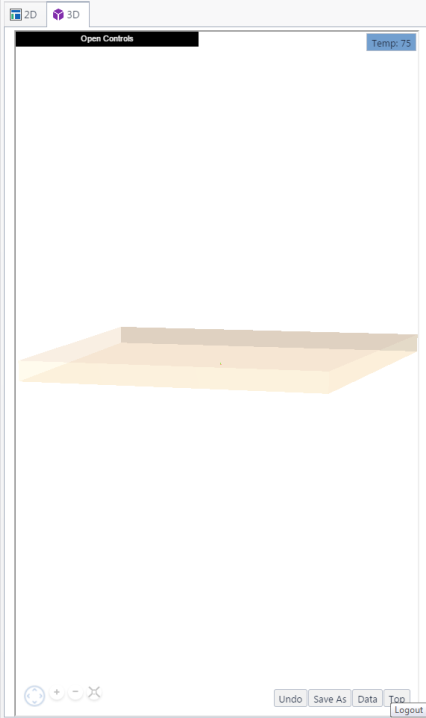
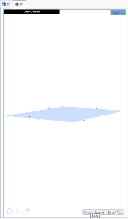
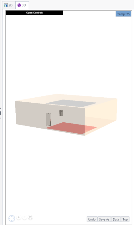
3D Location View
Displays the location in 3D View. Double clicking on a rack or device will select it in the infrastructure explorer.
Commands
The following commands are available:
- Rotate: Controls the angle of the object. Click “Up,” “Down,” “Left” or “Right” arrows to rotate.
- Zoom In/Zoom Out: Changes the zoom level of the object. The “plus” icon magnifies, and the “minus” minimizes.
- Reset View: Resets the object view to the default position.
- Show Power: Displays the power being used be each device directly above it.
- Show Temperature: Displays the temperature of each device directly above it.
- Show Space: Shows the amount of space available (where applicable).
- Undo: Reverts the 3D view to default.
- Save Image: Saves an image file of the selected node to your default download folder.
- Auto Rotate: Causes the 3D preview image to slowly rotate.
- Top View Rotated: Toggles the 2D top view rotated 90 degrees.
- Top View: Toggles the 2D top view.
Additional Controls
The following controls are available by clicking Open Controls.
- Rack: Displays the details of the selected rack
- Device: Displays the details of the selected device
- Info: Displays information about the selected object
- Walls Opacity: Changes how wall opacity is displayed
- Racks Opacity: Changes how rack opacity is displayed
- Visible Flooring: Checking checkbox makes floor visible. Unchecking checkbox makes floor invisible.
- Visible Ceiling: Checking checkbox makes floor visible. Unchecking checkbox makes floor invisible.
- Invert Mouse: Checking checkbox inverts mouse controls when adjusting view while in first-person mode.
- Level: removes the listed level from the 3d view. This option is only relevant when a building is selected.
Location Properties Pane
All locations are defined by their properties which are displayed under tabs in the Location Properties Pane. The properties vary based on the type of the location they represent.
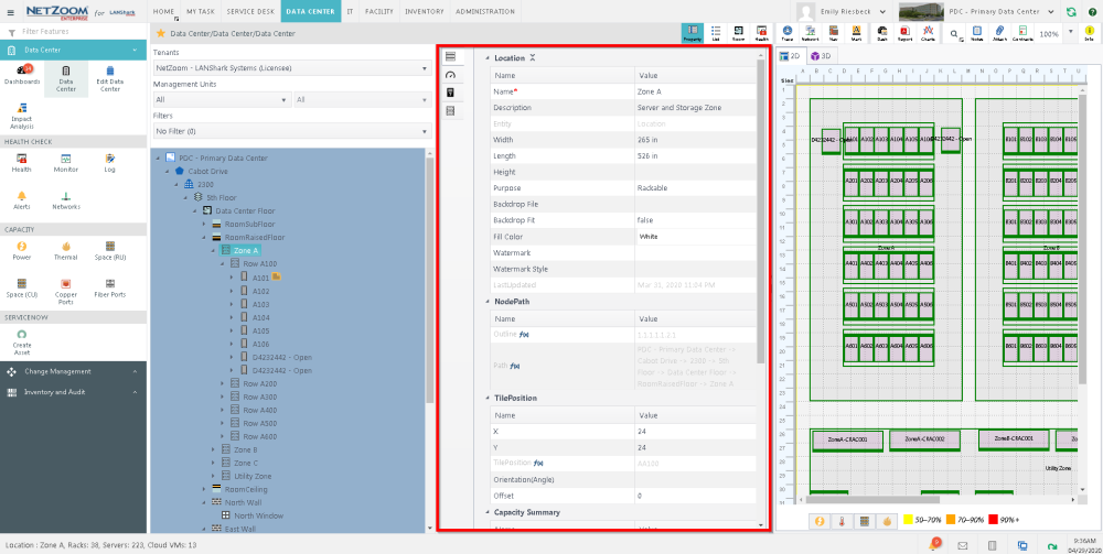
Example Properties of Location
| Tab | Property | Description |
|
Property |
Location | Name, Description, Entity. |
| Node Path | Physical and logical placement of the location. | |
| Capacity Summary | Capacity summary information. | |
| Capacity | RU Capacity | RU (Provision, De-rated, Threshold, Real Time, Blocked, Free, Maximum Load). |
| Power Capacity | Power (Provision, De-rated, Threshold, User Defined, Real Time, Free). | |
| Heat Capacity | Heat (Provision, De-rated, Threshold, User Defined, Real Time, Free). | |
| Cooling Capacity | Cooling (Provision, De-rated, Threshold, User Defined, Real Time, Free). | |
| Temperature Capacity | Temperature (Provision, De-rated, Threshold, User Defined, Real Time, Free) | |
| Total Power Ports | Power Ports (Provision, De-rated, Threshold, User Defined, Real Time, Free) | |
| Total Fiber Ports | Fiber Ports (Provision, De-rated, Threshold, User Defined, Real Time, Free, Blocked Port). | |
| Total Copper Ports | Copper Ports (Provision, De-rated, Threshold, User Defined, Real Time, Free, Blocked Port). | |
| Owner | Tenants, management units and sub-units that own the device. |
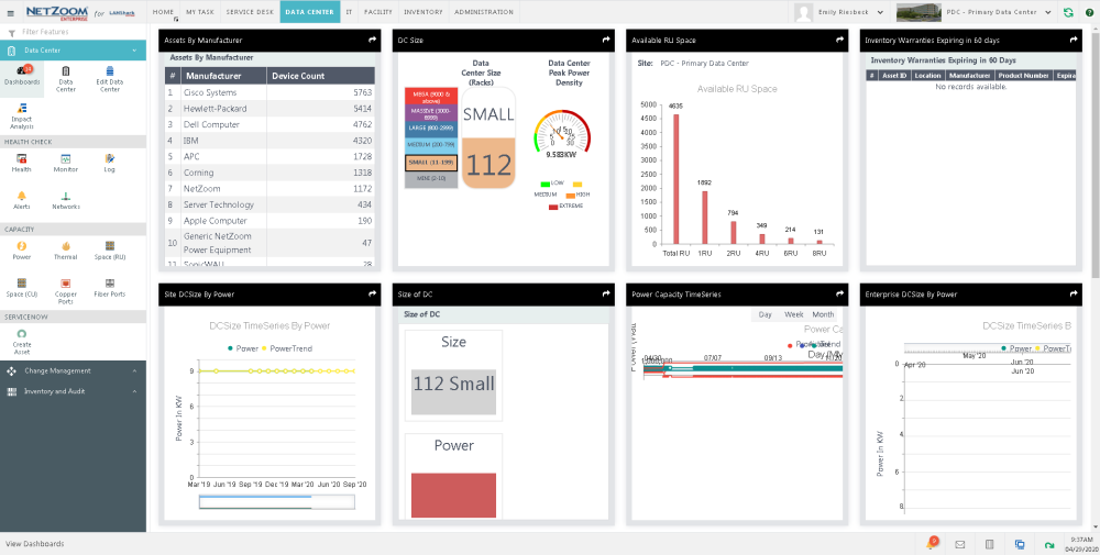
Dashboards Pane
The Dashboards Pane displays one or more dashboards pinned by the user to the screen. It offers an at-a-glance view of information in easy to use graphical formats. You can click on a dashboard to maximize it. For more information on Dashboards, see the Dashboards and Analytics section of this document.
Dashboard Controls
The following controls are available while a Dashboard is maximized.
- Open in New Window: Opens the Dashboard in a new browser window.
- Export to PDF: Saves the Dashboard as PDF on user’s computer.
- Refresh: Refreshes the Dashboard.
- Cancel: minimizes the dashboard and returns to the default view.
Dashboard Views
- Full Size View: Displays a Dashboard in full size window preview.
- Tab View: Displays the Dashboards as tabs. To switch to another Dashboard, select a tab.
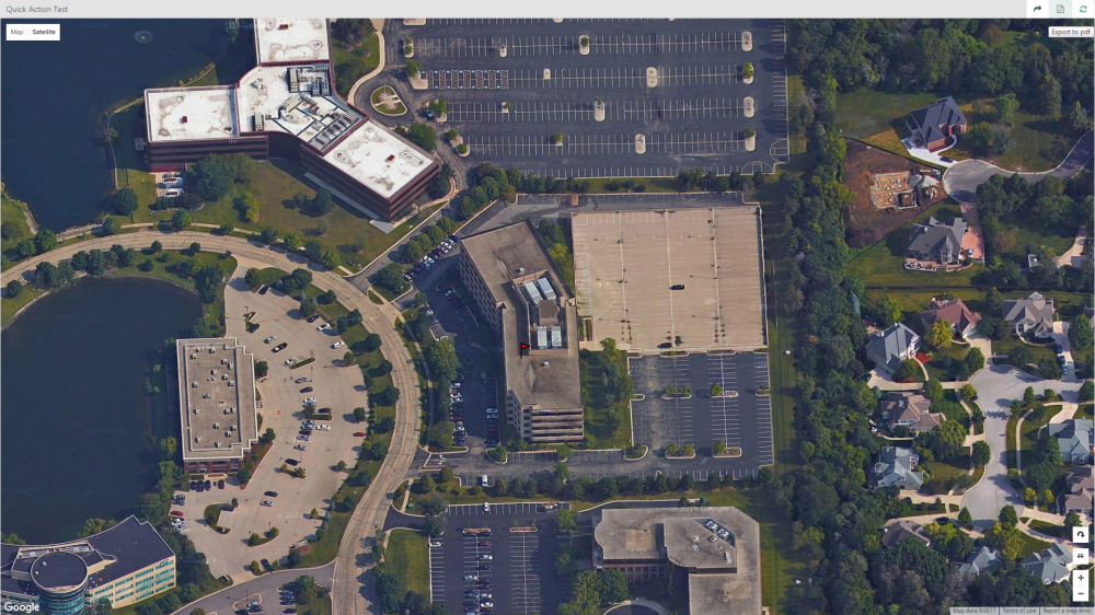
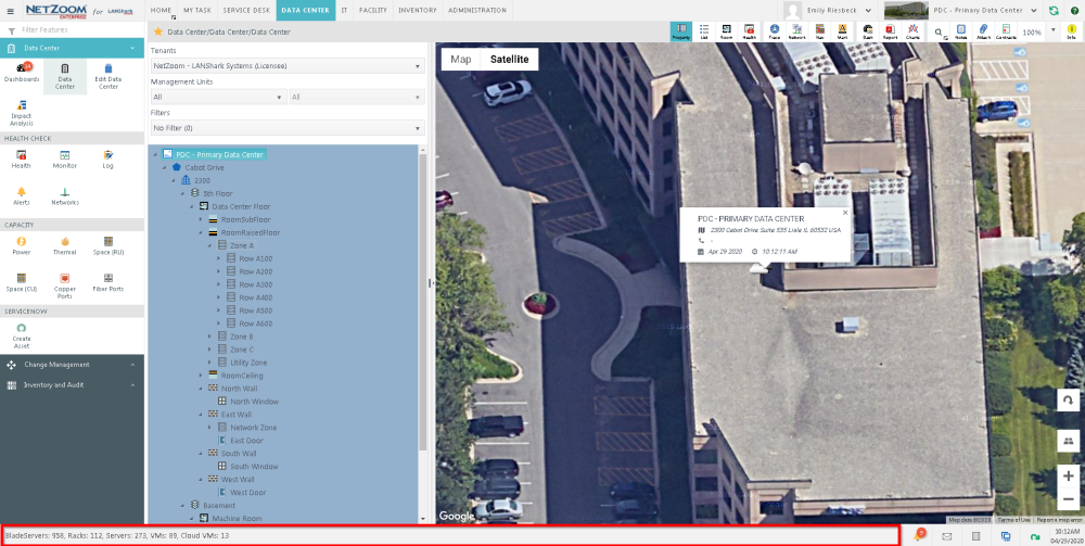
Google Maps Pane
The Google Maps Pane offers a map view of your site(s). The pane offers standard Google map controls, such as: Street View, Satellite View, Zoom In, Zoom Out, Rotate Map and 3D View.
Controls
The following controls are available.
-
Street View: Displays the maps in street view.
- Satellite View: Displays the maps in satellite view.
- Zoom In: Magnified the image of the object.
- Zoom Out: Increases the distance between object and viewer.
- Rotate Map: Rotates map to present a different perspective to the viewer.
- 3D View: Displays the objects in 3D view (applicable to buildings, not landscapes).
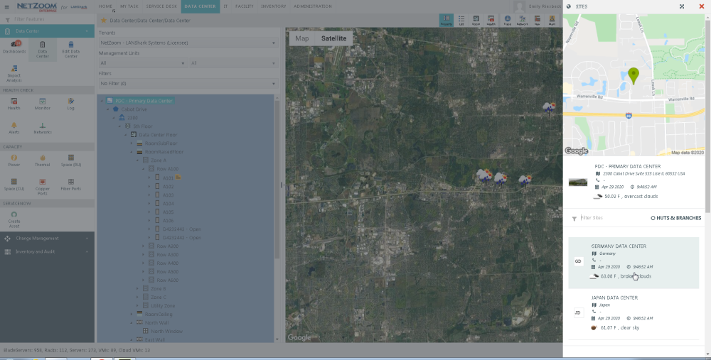
Sites Pane
The Sites which a user is authorized to see or manage are shown in the Sites Pane. A Site listing consist of site name, address and site local time. To switch to another site, double click on it in the Site's pane. That will become the active site.
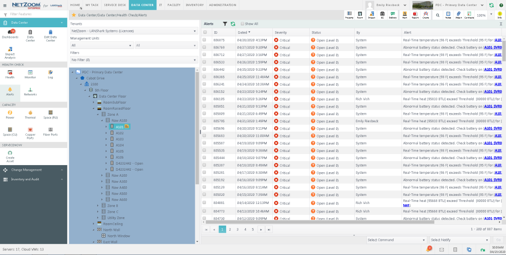
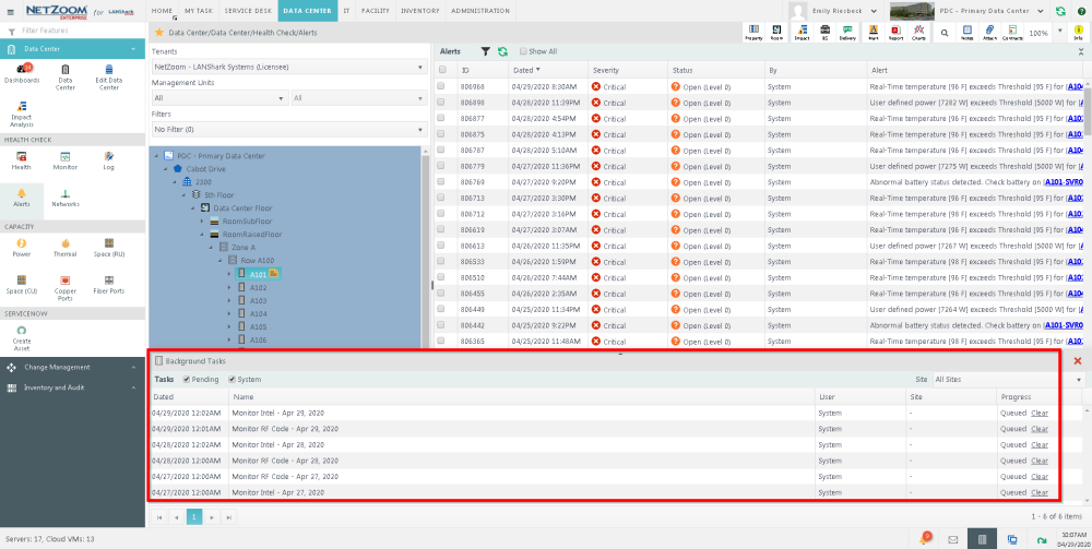
Alerts Pane
The list of all alerts is displayed in the Alerts Pane. The alerts can be sorted by column and filtered by criteria. Alerts are defined by:
- Date
- Status
- Alert
- Attempt
- By
- Assigned To
Background Tasks Pane
The list of all background tasks is displayed in the Task Pane. The tasks can be sorted by column and filtered by Pending task (tasks which are currently in progress) and System tasks (tasks which were automatically started by the system) For more information on Tasks, see [application quick actions documentation]. The Tasks are defined by:
- Date
- Name
- User
- Site
- Progress
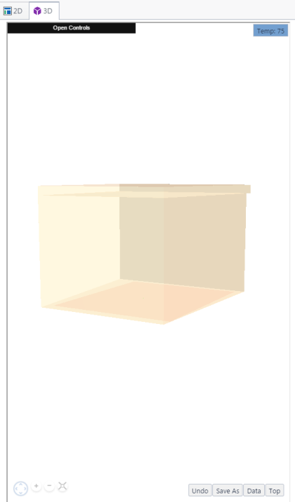
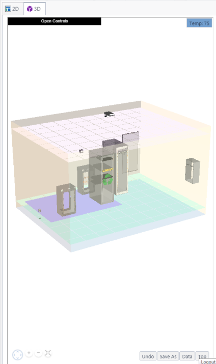
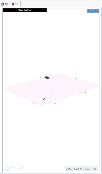
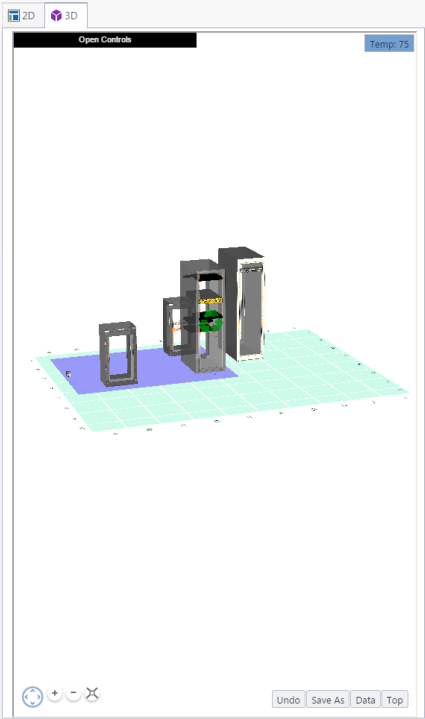
3D View
3D
 The 3D view displays the data center infrastructure in 3D view, if such view is offered

The following items can be visualized:
- Plot
- Building
- Roof
- Wall
- Room
- Ceiling
- Floor
- Subfloor
- Level
- Door
- Window
- Fan
- Rack
- Device
Plot
Building
Roof
Wall
Room
Ceiling
Floor
Subfloor
Level
Row of Racks
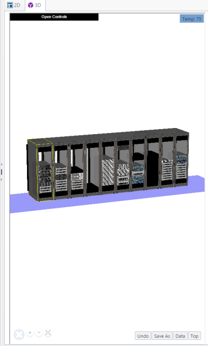
Rack
Device
Additional Controls
Controls
Reset View

Returns the view to the default view.
Rotate

Controls the angle of the viewed object; click "Up”, “Down”, “Left” or “Right” arrows to change the angle.
Zoom In or Out

Changes the zoom level of the object in the map; click "+" and "-" buttons to change the zoom level
Show Power

Displays power consumption for devices and racks, color coded based on their listed capacity.
Show Temperature

Displays temperature for devices and racks, color coded based on listed limitations.
Show Space

Displays capacity for racks, color coded based on their listed capacity.
Select Data Fields

Overlays devices and racks with information from properties.
- To change what shows as overlay properties in 3D view, click [select data fields] icon. The Capacity Data form will popup.
- In the Display Capacity Data drop down box, check [X] the properties you want to display on the device.
- Check [X] “Display Alarm State” if you want to overlay the highest level of alert for each device.
- Click the [SAVE] button. The selected properties, and the level of alert, will be overlayed.
Undo

Reverses the last move, rotation or zoom.
Save as

Downloads a screenshot of the displayed object to your computer.
Auto Rotate

Causes the 3d view to automatically rotate counter-clockwise.
Top View Rotated

Shows the top view, at a 45 degree angle.
Top View

Shows the top view.
First Person View

Switches to “First Person View” from the perspective of someone standing in the selected location.
Additional Controls
- Rack: displays the details of the selected rack.
- Device: displays the details of the selected device.
- Info: displays information about the selected Slot or Port.
- Walls Opacity: changes how wall opacity is displayed.
- Racks Opacity: changes how rack opacity is displayed.
- Visible Flooring: Checking checkbox makes floor visible. Unchecking checkbox makes floor invisible.
- Visible Ceiling: Checking checkbox makes floor visible. Unchecking checkbox makes floor invisible.
- Invert Mouse: Checking checkbox inverts mouse controls when rotating a device. Unchecking returns to normal.
User Information
User Information provides basic details about a user including contact information. Each user can edit their information by clicking the Logged-In User to open the User Profile.
Editing User Information
- To edit your user information, click on the Logged-In User to open the User Profile
- Select the Edit hyperlink next to the user name to edit user information. The User Details form will popup.
-
Edit any desired information.
- Click the [OK] button to save changes.
Adding a Phone or Email
- To add a phone email, click [PLUS icon] next to the email or phone field, respectively. A blank form will appear.
- Enter the email or phone number in their respective fields. A description is optional.
- Click the [SAVE] icon to save. Repeat this process to save multiple emails or phone numbers.
Status Bar
The Status Bar displays critical alerts, information and status updates of the site the user is logged into. The Status Bar is located at the bottom of the user interface.
Application Quick Actions
Application Quick Actions are located on the Status Bar.
Date/Time
The date/time action displays the local time of the active site. Hovering over date/time will display the time zone as a tooltip.
Critical Alerts
The Critical Alerts of a site can be accessed from the Status Bar. The alerts can be sorted by column field, and are listed by date, time and location of occurrence, severity, status, number of delivery attempts and the staff they were assigned to.
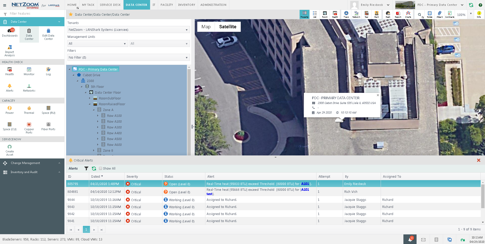
Alert Details
When you double click on an alert, the details of that alert will pop up. This includes the alert’s log, as well as alert commands.
Alert Commands
While an alert is selected, you can use the “Select Command” drop down box to select a command for the alert.
- Escalate: Escalates the alert to the next level, based on the escalation rules.
- Assign to me: Assigns the alert to the active user.
- Resubmit: Resubmits the alert as its lowest escalation level.
- Close: Closes the alert. A closed alert will not continue to escalate.
Notification Commands
While an alert is selected, you can use the “Select Notify” drop down box to select a group that will be sent a message regarding the alert.
- All Authorized: Sends a message to all users authorized to view and manage the alert.
- All Assigned: Sends a message to all users assigned to the alert at all escalation levels.
- All assigned at Current Escalation: Sends a message to all users assigned to the current escalation level.
Alert Controls
- To issue a command or send a message for an alert, select the command or message in the “Select Command” or “Select Notify” drop down boxes, respectively.
- Click the [GO] button. If a message is selected, the Add Notes form will pop up.
- Fill in the note you want to send to users and click the [ADD] button.
Background Tasks
Most tasks within NetZoom execute synchronously: the task must finish before another task can begin. However, certain tasks that take longer to complete execute as Background Tasks. These tasks are executed asynchronously, behind the scenes as you work.
Background Tasks displays operations performed in the application which take a longer time to complete. Examples of such tasks are inventory imports and scheduled database maintenance. Visualizing the background tasks in progress allows the user to queue tasks, monitor their status and manage the system resources according to priorities.
- Date-indicates the date and time the task was started
- Name-indicates the name of the task
- Progress-indicates the progress of the task in percentage. “Killing” a task will stop the progress of the task.
Viewing Background Tasks
- To view Background Tasks, click on the [tasks icon] icon on the Status Bar. Background Tasks that are currently running will appear in a list. The list shows the date when the Background Task began, the name of the Background Task, and the progress meter of the task.
Stopping a Task in Progress
- To stop a background task, click the [KILL] button next to the progress meter. The background task will stop.
Details of a Background Task
Double clicking on a task will open the Task Progress popup. This popup will show a log of the task and a progress bar. Click the [Download log as text file icon] icon to download the log as a text file. Click the [CANCEL] button to cancel the task.
Completed Background Tasks
To view completed background tasks, check [X] Show. To delete a completed Background Task from the list, click the [CLEAR] hyperlink.
Messages
Messages sent to you can be viewed from the status bar. Clicking the Messages action will display all messages sent to the logged-in user, along with the date they were sent and who they were sent by.
Closing a Message
- To close a message, click [CLOSE] under the Action column. The Add Notes form will pop up.
- Add a note that will be included in the log and click the [ADD] button. The message will be removed from the list.
Demo
The Demo action allows you to save records of your place in the application for the purpose of demonstrating features to others.
Clicking the Demo action will display the Demo form. Here, a demonstration profile can be created and feature records can be added to it. This allows you to create a visual step-by-step slideshow of a feature.
Creating a Demo Profile
- To create a demo profile, first create a blank .txt document. Name the document whatever you want the profile to be named.
- In the application, click the Demo action to launch the Demo form and click the [UPLOAD] button. A search window will launch.
- Navigate to the .txt document, select it and click the [OPEN] button. The profile will be created. Profiles can be selected using the Select Profile drop down box.
Adding a Record to a Demo Profile
- To add a feature record to a demo profile, navigate to the site, feature node and quick action you want to record and open the Demo form.
- Click the [plus] icon. The Add form will pop up.
- Enter an ID for your record. This id must be unique.
- The Topic field determines how the record will be labelled. The Select ID and NodePath fields will be automatically filled when a node is selected in the feature. The Wait field determines how long the record will display (in seconds) before moving on to the next record. The Notes field includes any additional information the user wants to add.
- Click the [SAVE] button. The record will be saved and added to the profile
Editing a Record
- To edit a feature record, select it and click the [edit record] icon. The Edit form will pop up.
- Make any desired changes and click the [SAVE] button to save them.
Deleting a Record
- To delete a feature record, select it and click the [delete] icon. A popup will confirm your selection.
- Click the [YES] button. The record will be deleted.
Navigating to a Record
Double clicking on a feature record will navigate you to the site, feature and node of the record.
Playing Records
- To play feature records in a profile, click the [PLAY] button. The Play Demo form will pop up.
- The Transition field determines how many seconds a feature record will display before moving to the next one. The Sound field determines what sound plays when a new feature record is displayed. Check [X] Repeat if you want the demo to repeat when finished.
- Click the [CONTINUE] button to play the demo. This will display feature records in order. Clicking the pause button will pause the demo. Clicking the stop button will stop it.
Downloading a Profile
- To download a demo profile, select it in the Select Profile field and click the [DOWNLOAD] button. The demo profile will be opened as a separate tab in your browser.
Deleting a Profile
- To delete a demo profile, select it in the Select Profile field and click the [DELETE] button. A popup will confirm your selection.
- Click the [YES] button. The profile will be deleted.
New Session
The New Session action will open a session of NetZoom in a new tab of your browser.
Logout
The Logout action logs the user out of the NetZoom application.
Infrastructure Explorer
The Infrastructure Explorer presents data center infrastructure in a tree view. The Infrastructure Explorer offers a multi-tiered filter, refining results by Tenants, Management Units, and criteria Filters. Tenant determines the owner of the device. Management Units are organizational units within a company. Filters are specific device criteria that can be created and customized by users.
Owners and Tenants
Items in the Infrastructure Explorer can be associated with one or more owners. To assign a company as the owner of the item, that company must be classified as a tenant. Selecting a tenant in the infrastructure explorer will limit results to that tenant’s devices.
For example, if a licensee rents three racks in a data center to another company, the renting company can be added to NetZoom as a tenant and authorized as an owner of the racks. This allows the tenant to manage these racks in NetZoom and if the infrastructure explorer is filtered to only show devices owned by the selected tenant
Adding a Company as a Tenant
Using the Company Group feature under Administration, an authorized user can add one or more companies to the company group named Tenant. For more information, see [Lists document]
Authorizing a Device to a Tenant
Once a company is labeled as a tenant, they can be authorized as owners of devices. This can be done in the Devices by Tenant feature, under Administration. For more information, see [Authorization document].
Management Units
The Management Units filter has two parts: Organizational Categories and Management Units. Using the Management Units feature under Administration, organizational categories and management units can be created. Items in the Infrastructure Explorer can be associated with one or more Organizational Categories and Management Units.
For example, the organizational category “installations” could be created, with the management units “hardware installations” and “software installations.” Devices could be assigned to these management units as needed.
For more information, see [Lists document].
Filters
The Infrastructure Explorer uses the selected filter to limit what items are represented in the explorer tree. NetZoom has many ready-to-use search criteria and users can create custom criteria. Filters in the Infrastructure Explorer are taken from saved searches in QA: Advanced Search as well as those created in the Filters feature group. For more information, see [QA: Advanced Search document] and [Filters document].
Using the Infrastructure Explorer
The Infrastructure Explorer presents a hierarchy of data center infrastructure, including plots & staging areas, buildings, rooms, racks and devices in tree format. In the Inventory menu, the Infrastructure Explorer instead displays inventory models and devices organized by group.
Refining Results
To refine results, select the Tenant, Management Units, or Filters combo box and make a selection from that list. The results in the explorer tree will be limited to infrastructure that meets your criteria.
Navigating the Explorer Tree
To view the contents of an infrastructure item, click the [arrow icon] expander arrow to expand or collapse the item.
Common Controls
The following actions are commonly used throughout the application.
Actions
Actions are contextual icons that appear in certain features on the bottom of the Explorer or Properties panes. Actions perform standard actions such as add, delete, clone, download, etc., and always appear at the bottom of Explorer Pane or the Properties Pane. The Actions are contextual features that change according to the selected feature. Some of the features will have no Actions.
Add

Adds a new object to the list.
Delete

Deletes the selected object from the list.
Clone

Creates a duplicate of the selected object and adds it to the list.
Add child

Adds a child of the selected object to the list.
Discover

Searches for a discoverable device e.g. IP camera, servers, etc. and adds it to the list.
Download

Downloads a file to the computer.
Purge

Purges the log of the selected category.
Add a Business Service

Adds a Business Service to the list.
Add an Application Service

Adds an Application Service to the list.
Filters

Features that list items in a heavily populated table, such as alerts, contracts and the List View Quick Action offer the ability to filter the items that are shown in the table. When the [] icon is clicked, the Filters form will appear, displaying filters currently in use and offering controls to create custom filters.
Creating a Filter
- To create a filter, click the [] icon. The Filters form will appear.
- Click the [
] icon. A blank Condition form will appear.
- Fill in the Criteria using the following fields:
- Logic: Includes the logical operators and & or.
- Field: Determines what field the criteria will search in.
- Operator: Includes relationship operators such as equal to and greater than.
- Value: Determines what value the criteria will search for.
- To delete search criteria, select the criteria and click the [] icon.
- To filter results using the chosen criteria, click the [
 ] icon.
Last Updated: Thursday, August 13, 2020
NetZoom, Inc.